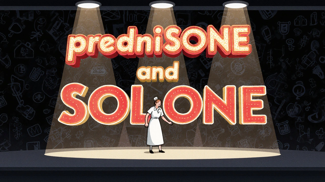
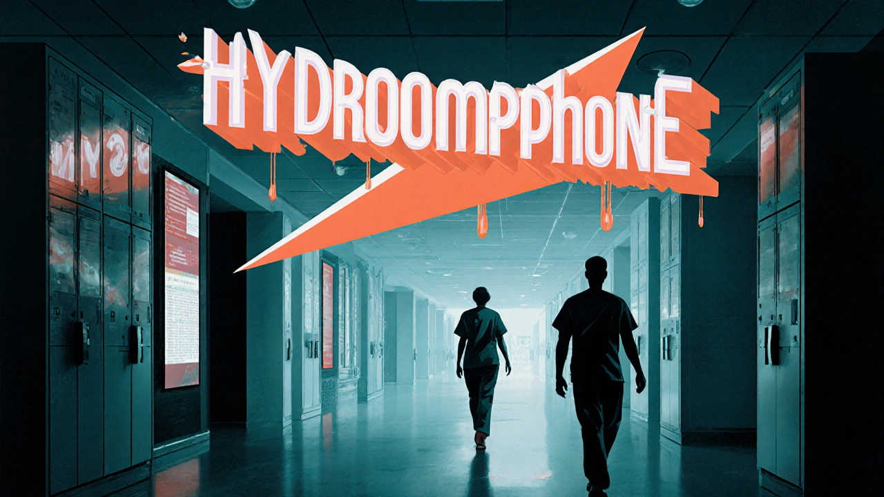
Every year, thousands of patients are harmed because two drugs look or sound almost identical. A nurse grabs predniSONE instead of predniSOLONE. A pharmacist dispenses HYDROmorphone thinking it’s morphINE. These aren’t hypothetical mistakes - they happen in hospitals, clinics, and community pharmacies every single day. The fix isn’t expensive. It doesn’t require new machines or extra staff. It’s called tall-man lettering.
What Is Tall-Man Lettering?
Tall-man lettering is a simple visual trick: you capitalize the parts of drug names that are different. It turns confusing pairs like vinblastine and vincrestine into vinBLAStine and vinCRIStine. The capital letters jump out, making it harder to pick the wrong one - especially when you’re tired, rushed, or working in a noisy environment.This isn’t just a suggestion. It’s a safety standard backed by the U.S. Food and Drug Administration (FDA), the Institute for Safe Medication Practices (ISMP), and health agencies in Australia, New Zealand, and the UK. The goal? Reduce look-alike, sound-alike (LASA) drug errors - one of the top causes of preventable medication mistakes.
Before tall-man lettering, many errors happened because the brain automatically fills in gaps. If you see “prednisone” and “prednisolone” in small, lowercase text, your eyes skim over the similar parts. But when you see “predniSONE” versus “predniSOLONE,” your brain catches the difference instantly. It’s like highlighting the key letters in a word puzzle.
How It Works: Real Examples
Not all drug pairs need the same treatment. The capitalization follows rules based on where the difference occurs. Here are common examples used in hospitals and pharmacies:
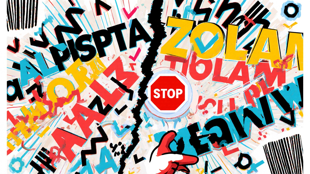
- ALPRAZolam vs. LORazepam - the “Zolam” and “zepam” are different, so the capital letters show it.
- CISplatin vs. CARBOplatin - “CIS” and “CARBO” are the key differentiators.
- HYDROcodone vs. oxyCODONE - the capitalization highlights the root difference in the middle of the name.
- PARoxetine vs. FLUoxetine - the first two letters are changed to uppercase to make them stand out.
These aren’t random. They’re based on decades of research into how people read and process text under pressure. A 2004 eye-tracking study by ISMP found that when tall-man lettering was used, pharmacists made 35% fewer selection errors in simulated dispensing tasks. That’s not a small gain - it’s life-saving.
Where It’s Used
Tall-man lettering isn’t just on paper labels. It’s built into the systems you use every shift:
- Electronic Health Records (EHRs) - When you type in a drug name, the system auto-formats it with capital letters.
- Automated Dispensing Cabinets - The names on the screens and printed labels use tall-man lettering.
- Prescription Labels - Whether printed at the pharmacy or generated by a hospital system, the drug name appears correctly formatted.
- Medication Administration Records (MARs) - Nurses check the name against the label - tall-man lettering helps them match faster and more accurately.
In Australia, the National Mixed-Case Lettering List includes 192 drug pairs that must be formatted this way. In the U.S., the FDA’s list has 72, and ISMP tracks over 250. These lists are updated quarterly based on new error reports. If a near-miss happens because two names were too similar, regulators review it and add the pair to the list.
Why It’s Not a Silver Bullet
Some people think tall-man lettering should fix everything. It doesn’t. A 2016 study in Pediatrics claimed it didn’t reduce errors - but that study had a major flaw: it didn’t check if hospitals actually implemented it correctly. Many didn’t.
The real issue? Inconsistency. One system uses PARoxetine, another uses paroxetine. A community pharmacy prints one way, the hospital’s Cerner system prints another. That’s worse than no tall-man lettering at all - it creates confusion.
Also, it doesn’t help with all drug pairs. For example, metoprolol and methyldopa start differently, but the key difference is in the first syllable. Tall-man lettering can’t fix that if the capitalization starts too far into the word. In those cases, other tools like barcode scanning or forced double-checks work better.
Dr. Michael Cohen of ISMP says it best: “Tall-man lettering is not a panacea. It’s one layer in a defense-in-depth approach.” That means it works best when combined with:
- Barcode scanning before giving any drug
- Independent double-checks for high-risk medications
- Clear communication during handoffs
- Standardized abbreviations
How to Implement It Right
If you’re in a hospital or pharmacy setting, here’s how to get it right:
- Form a team - Include pharmacists, nurses, IT staff, and a medication safety officer. Don’t leave this to one person.
- Use the official list - Start with ISMP’s or your country’s National Mixed-Case Lettering List. Don’t make up your own rules.
- Check all systems - Make sure your EHR, dispensing cabinets, label printers, and billing systems all use the same format. If they don’t, fix the system, not the user.
- Train everyone - Don’t assume staff know why the letters are capitalized. Explain the “why” behind it. Show them examples of errors that were avoided.
- Monitor and adjust - Track how often LASA errors still happen. If errors persist, the capitalization might be wrong, or the system isn’t applying it consistently.
Implementation doesn’t have to be expensive. A 2021 report in Australia found the average cost per hospital was under AU$1,200. The real cost is time - about 16 weeks to roll out across all systems in a 500-bed hospital.
What’s Changing Now
The FDA and ISMP are working together to unify their lists. Right now, they sometimes recommend different capitalization for the same drug pair. That’s confusing. A joint list expected in 2024 will fix that.
Some hospitals are testing AI-powered tall-man lettering. Epic Systems is piloting a system that learns from real-time error data and adjusts capitalization patterns automatically. Early results show a 29% greater reduction in errors compared to static lists.
But here’s the bottom line: even with AI, barcode scanners, and smart alerts, tall-man lettering remains vital. Why? Because humans still read. Humans still click. Humans still make snap decisions under pressure. And when they do, a well-placed capital letter can be the difference between safety and harm.
What You Can Do Today
Whether you’re a nurse, pharmacist, doctor, or admin staff:
- Look at your EHR. Do drug names use tall-man lettering? If not, ask why.
- When you see a drug name that looks too similar to another, pause. Is the difference highlighted?
- If you’re using a system that doesn’t format names correctly, report it. Don’t assume someone else will fix it.
- Teach new staff. Show them the difference between ALPRAZolam and LORazepam. Make it part of orientation.
You don’t need a fancy tool to make a difference. You just need to notice. And when you do, you might just stop the next mistake before it happens.
What does tall-man lettering actually do?
Tall-man lettering uses selective capitalization in drug names to visually highlight the parts that differ between similar-sounding or look-alike medications. For example, writing "predniSONE" and "predniSOLONE" makes it easier to spot the difference and avoid giving the wrong drug.
Is tall-man lettering required by law?
It’s not a federal law in the U.S. or Australia, but it’s required by safety standards. The Joint Commission’s National Patient Safety Goal mandates that organizations differentiate look-alike drug names - tall-man lettering is the accepted method. Hospitals that don’t use it risk failing inspections.
Why do some systems use different capitalization for the same drug?
Different vendors (like Epic, Cerner, Meditech) sometimes interpret guidelines differently. Some use FDA standards, others follow ISMP. This inconsistency creates confusion. The FDA and ISMP are working on a unified list to fix this by 2024.
Does tall-man lettering work for all similar drug names?
No. It works best when the difference is in the middle or end of the name, like "vinBLAStine" vs. "vinCRIStine." It’s less effective if the difference is at the start, like "metoprolol" and "methyldopa," because capitalizing the first letters doesn’t help if they’re already different.
Can I just use bold or color instead of capital letters?
Bold or color can help, but they’re not reliable. Color can be lost in grayscale printing. Bold text doesn’t change how the brain processes letter patterns. Tall-man lettering works because it changes the actual shape of the word - something the brain recognizes instantly, even under stress.
How do I know which drug pairs need tall-man lettering?
Use the official lists: ISMP’s quarterly updated list in the U.S., or Australia’s National Mixed-Case Lettering List. These are based on real error data. Never guess - always refer to the authoritative source.
Comments
james thomas November 25, 2025 at 21:10
Of course the FDA and ISMP love this. They're just trying to make us feel safe while they let Big Pharma get away with naming drugs like they're playing Scrabble with a drunk wizard. Tall-man lettering? More like tall-man *illusion*. They don't fix the root problem - corporate greed that churns out 200 similar-sounding drugs just to extend patents. You think capital letters stop a nurse from grabbing the wrong vial? Nah. It's the same reason we still have traffic lights - we're too lazy to fix the system, so we slap on a bandage and call it progress.
Deborah Williams November 27, 2025 at 18:42
It’s funny how we’ve turned patient safety into a typography contest. We spend millions training people to read differently instead of just… naming drugs better. Why not call them ‘Hydro-17’ and ‘Morph-23’? No one’s going to confuse a number with a chemical structure. But no - we cling to Latin-sounding names because it makes us feel smart. Meanwhile, real people are dying because we’d rather optimize the font than redesign the system. The real tragedy isn’t the capital letters - it’s that we’ve accepted this as normal.
Kaushik Das November 28, 2025 at 12:33
Bro this is genius in India too - we have so many drug names that sound like Bollywood remixes. Like ‘Metformin’ and ‘Metoprolol’ - if you’re tired after 12-hour shift, you’re gonna mix ‘em up. I’ve seen it. But here’s the thing - we don’t even have consistent digital systems. One hospital uses tall-man, next one uses bold, next one uses color coding and then the pharmacy prints it in grayscale. So yeah, the idea is fire, but implementation? Chaotic. Like trying to run a marathon with shoes made of banana peels.
Asia Roveda November 29, 2025 at 13:36
Of course this works in the U.S. - where we have 12 different versions of the same drug, each with a slightly different name so we can charge more. This isn’t safety - it’s corporate damage control disguised as innovation. Meanwhile, in Canada, they just use generic names and save billions. But no - we need capital letters to feel like we’re doing something. Classic American solution: make the problem look fixed while the rot keeps growing.
Ezequiel adrian December 1, 2025 at 06:52
Yessss this is real talk 😎 I work in a clinic in Lagos and we don’t even have EHRs but we still use tall-man manually on sticky notes. It’s wild how one capital letter saves lives. Saw a nurse catch a mix-up last week - ‘HydroCODONE’ vs ‘oxyCODONE’ - she paused, squinted, and said ‘nah, that ain’t right’. That’s all it took. No robot. No AI. Just eyes and a brain. Respect.
Ali Miller December 1, 2025 at 14:59
Let’s be real - this is just another woke medical fad. You think capitalizing letters is going to stop someone from being careless? That’s like saying wearing a seatbelt means you can drive drunk. This isn’t a fix - it’s a performance. The real issue? Understaffed hospitals, overworked nurses, and zero accountability. We’re treating symptoms like they’re the disease. And now we’re making nurses memorize font rules instead of pharmacology. Pathetic.
JAY OKE December 2, 2025 at 09:41
I’ve been in ER for 18 years. Tall-man lettering? It’s the quiet hero. I don’t care if it’s ‘paroxetine’ or ‘PARoxetine’ - I look at the damn label twice anyway. But when it’s formatted right? I don’t even have to think. Saves seconds. Seconds save lives. No drama. No politics. Just clarity. If your system doesn’t use it, demand it. It’s free. It’s simple. It works.
Joe bailey December 3, 2025 at 02:28
Love this. I work in a small UK pharmacy and we’ve used ISMP’s list since 2019. No errors in LASA meds since. Not one. It’s not magic - it’s just good design. Like putting the ‘i’ in ‘pencil’ in red - you just notice it. And honestly? The fact that some systems still don’t use it is just lazy. Fix the tech, not the person. Simple. Also - I’ve started teaching new staff with flashcards. ‘ALPRAZolam’ vs ‘LORazepam’ - they laugh at first. Then they get it. And then they thank me. ❤️
Amanda Wong December 4, 2025 at 17:48
Stop pretending this is a solution. It’s a distraction. The real problem? No one checks the meds. No one double-checks. No one cares. You can make every drug name look like a neon sign and if the nurse is distracted by her phone or the screaming patient’s family, she’s still going to grab the wrong one. This is virtue signaling disguised as safety. The FDA doesn’t want to fix staffing ratios - so they give us capital letters and pat themselves on the back. It’s pathetic.
Stephen Adeyanju December 5, 2025 at 06:28
Look I get it but honestly who has time to memorize all these capital rules I mean its not like we got a cheat sheet on our phone and even if we did who’s gonna scroll through 200 pairs before giving a med in the middle of a code blue just sayin
Micaela Yarman December 6, 2025 at 05:50
While the utility of tall-man lettering is empirically supported, its implementation remains inconsistent across vendor platforms, thereby undermining its efficacy as a universal safety mechanism. The absence of standardized orthographic protocols in electronic health record systems constitutes a critical gap in patient safety infrastructure. It is therefore imperative that regulatory bodies enforce uniform typographic conventions across all clinical information systems to ensure fidelity of application.
mohit passi December 7, 2025 at 15:02
Man this is deep 🤔 I used to think it was just fancy typing but now I see - it’s like teaching your brain to see patterns faster. In India we have so many drugs with same endings - ‘-pril’, ‘-sartan’, ‘-olol’ - it’s chaos. But when you write ‘CARBOplatin’ vs ‘CISplatin’? Your eyes just lock on the C-A-R-B-O. No thinking. Just seeing. I showed my nephew - he’s 12 - and he got it in 2 seconds. If a kid can learn it, why can’t the system just do it? 🤖💡